10 Tips for Designing a Professional Photography Portfolio
Whether you already work in photography or are still building your brand, printing a professional photography portfolio is a great way to demonstrate your unique skills and style of photography when meeting new clients or networking during photoshoots.
A well-designed coffee table photobook that showcases some of the work you’re most proud of can also make a great addition to your photography studio.
Since tackling a personal project like this can be a bit daunting for photographers of all experience levels, we’ve lined up our top tips for designing a professional photography portfolio. Once you’re ready to get started, you can also take advantage of the exclusive discount Bob Books has made available to The School of Photography members.
Get access to ALL our online courses – 1000’s of videos, worksheets, critiques of student’s work, personalised support and much more with our monthly membership.
Define your Portfolio’s Purpose
The first thing to do once you’ve decided you’d like to design a professional portfolio is work out what exactly you will be using it for. For instance, you might simply want to create a general photography portfolio to showcase your skills and style of photography.
On the other hand, you might want to create a portfolio for a specific job you’d like to apply for or a different area of photography you’d like to start working in. Once you’re clear on what your portfolio’s purpose is, it will become easier to select images and decide on the style and layout.
2. Get organised
Before you even begin thinking about the layout or font style, you need to narrow down your image selection, and this is often the most difficult part of creating a portfolio. Of course, you’ll want to select your strongest images, but what you include will also depend on your audience and the specific skills you want to demonstrate.
For example, if you’re an architectural or real estate photographer, you’ll want to choose images that highlight those specific skills. If you have a few different areas of expertise, you could also break the portfolio up into different sections in order to showcase a range of skills from portraiture to product or event photography.
3. Demonstrate diversity
Your photographic portfolio should also demonstrate your diversity as a photographer.
Bear in mind that this doesn’t necessarily mean you have to include lots of different styles or disciplines of photography. For example, you might demonstrate diversity within your chosen photography discipline by showcasing photos taken with different types of lighting such as natural, flash or studio lighting, as well as both posed and candid shots.
4. Keep it concise
The best way to make a lasting impression with your photography portfolio is to keep it as concise as possible by including only your strongest images. This can be difficult to do, as you likely have lots of images you love and would like to showcase. Start by narrowing down your work to the images that best demonstrate your skills and the area you wish to work in. From here, try to pick 15-30 of the strongest ones to include.
5. Aim for a clean layout
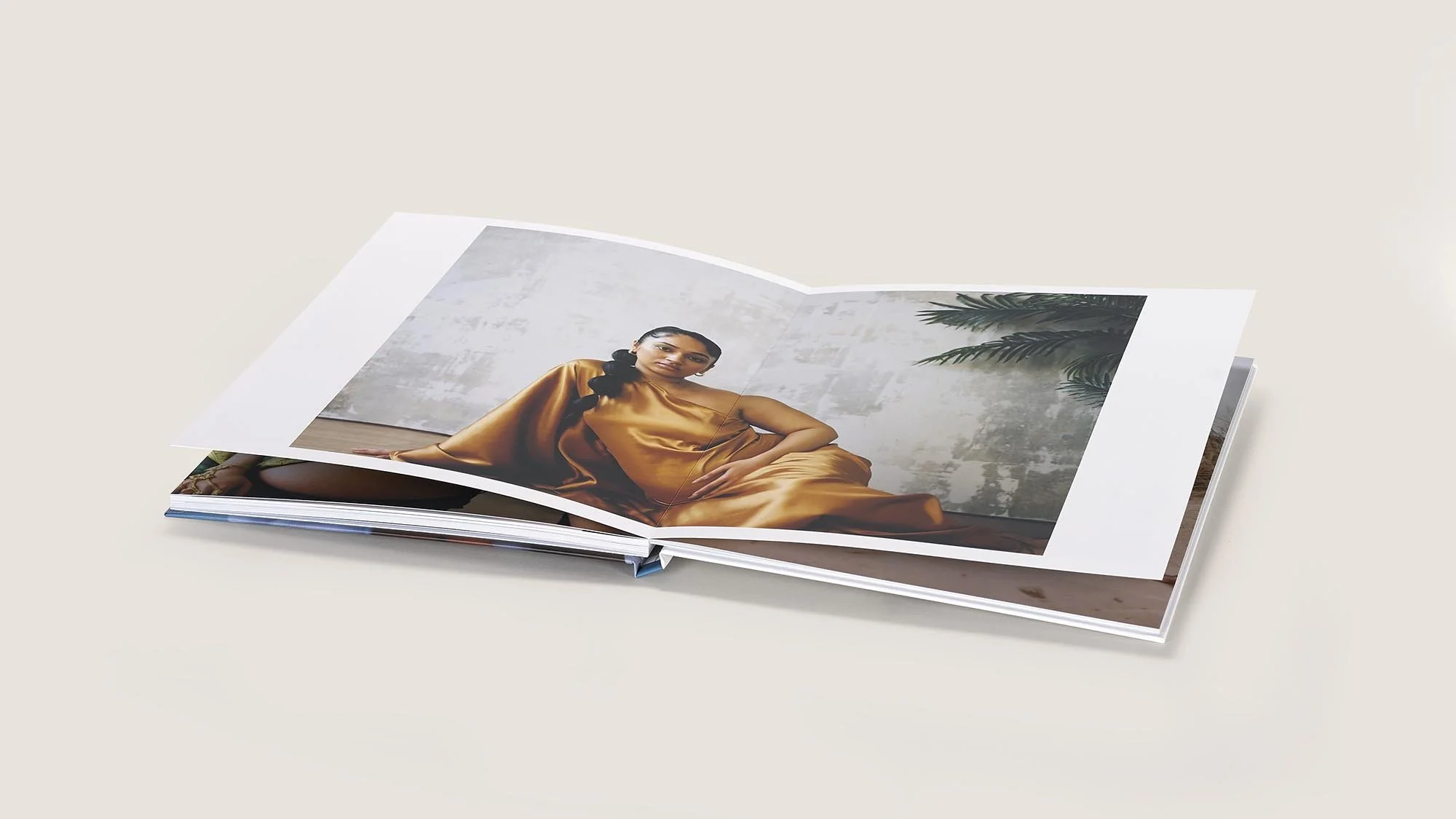
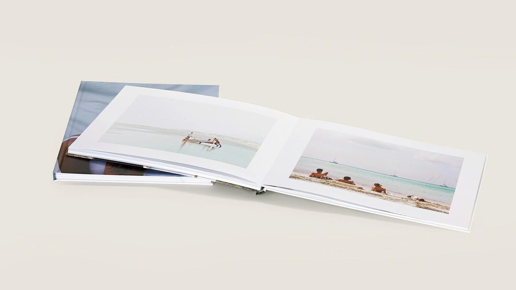
When it comes to your portfolio’s layout, less is more. Leaving some white space between images or between images and text helps each element stand out and make a stronger impact.
With this in mind, be sure to include at least some ‘white space’ or ‘negative space’ on each page in order to create a more balanced and harmonious layout. If you’re designing your portfolio with Bob Books, the PDF to Book creation method is ideal, as you’ll have full creative control over your project using Adobe InDesign.
6. Know your audience
If there’s a particular area of photography you’d like to work in, you’ll want to tailor your portfolio to that audience. One thing that can help you get a better idea of what your audience might expect to see is to spend some time reviewing the websites and portfolios of photographers who are already well established in that area, whether it’s wildlife, fashion or wedding photography.
7. Include QR codes
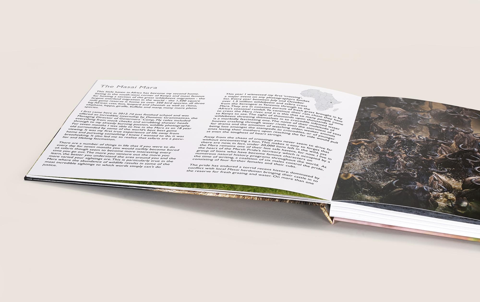
If you find yourself wishing you could include more background information about a particular photoshoot or project you worked on, why not include a QR code? Bob Books’ software makes it easy to include video footage in your photo book or portfolio and have it play live on the viewer’s phone or device when they scan the code. It could also be a good idea to add a QR code that takes the viewer directly to your website where they can find more information about how to contact or work with you.
8. Consider lay-flat binding
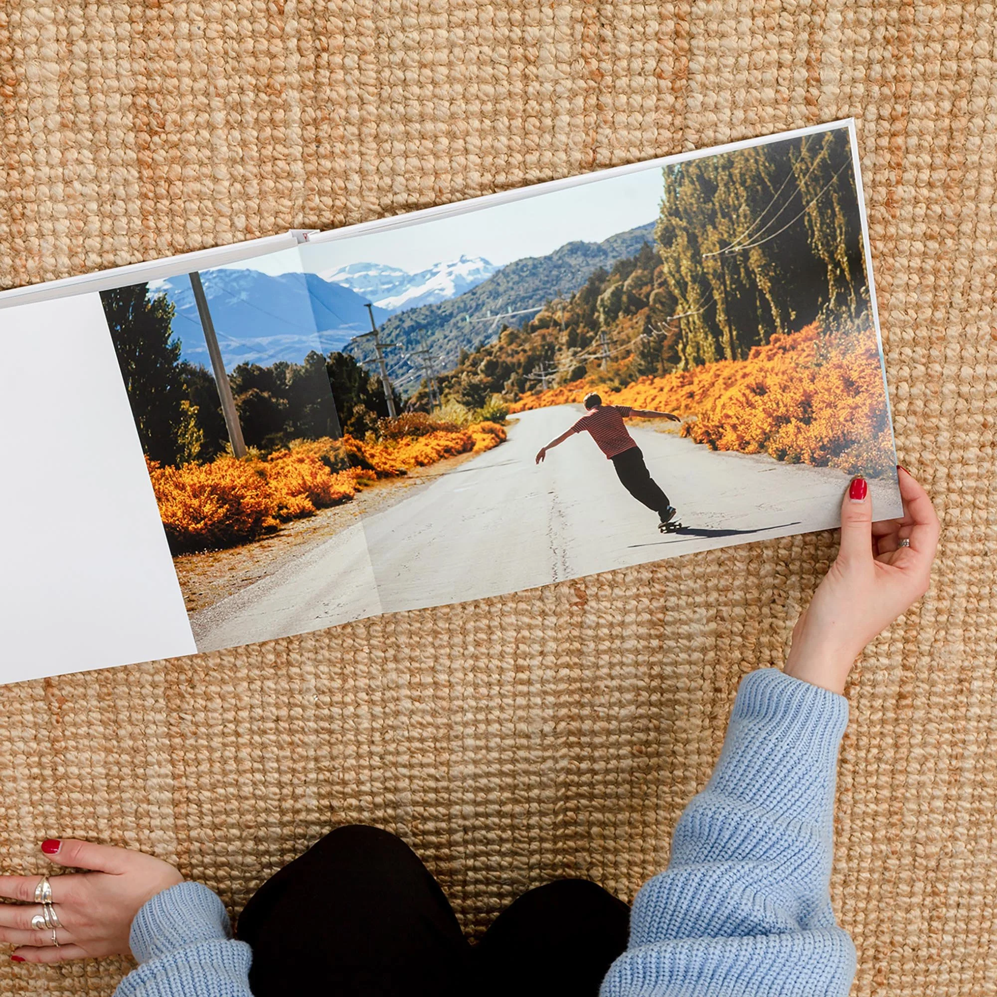
Lay-flat photobooks use a different book binding technique that allows the pages to be opened completely flat across the centrefold, without damaging the book’s spine. This will give you a lot more freedom when it comes to the layout, as your images can be printed seamlessly from left to right, with no crease in the centre of the pages. A lay-flat portfolio can also be nicer to flip through, as the pages are thicker and don’t spring back the way perfect bound books do.
9. Choose the right paper type
The paper type you choose for your photography portfolio will also have an impact on the final product. Gloss photographic paper, for example, brings out the vibrancy of colours and enhances detail, which could make it a good option for highlighting pet or wildlife photography. On the other hand, matte photographic paper has a softer finish and doesn’t reflect the light, which creates a more artistic effect and emphasises elements such as light and composition. With this in mind, spend some time thinking about the pros and cons of each paper type and select the one that will bring out the best in your photographs.
10. Get trusted feedback
Finally, even if you think you’re happy with your images and layout, it’s a good idea to get some feedback from one or two trusted friends or co-workers with an eye for photography or graphic design. A fresh pair of eyes will provide a different perspective and help you spot things that could be improved on, whether it’s using a different font, adding in some headers and footers or including an ‘About me’ page.
Ready to design a portfolio that showcases your creativity and technical abilities as a photographer? Visit the Bob Books website to take advantage of the exclusive discount that's available for The School of Photography members.


